LOADS RUNNER
Redesigned for efficiency, revamped for success
SaaS platform designed to streamline dispatch operations tailored for the trucking industry
Background
Traditionally, dispatchers and managers struggled with cumbersome processes, scattered data, and limited visibility into fleet operations. The now 'CEO' recognized the challenges faced by dispatch organizations and got a vision to revolutionize trucking dispatch and embarked on a journey. But unfortunately the project got stuck in a maze of problems.
THAT'S WHEN I CAME TO THE RESCUE ! JK.....maybe not.
When I saw the product, it was like a messy room with stuff everywhere and no clear way to move around. So, I rolled up my sleeves and got to work.
Team
Product Owner, 2 Developers, and Graphic Designer
Time Duration
4-5 Months
Process
Understanding the product and issues, User interviews, IA and user flow, low-fi wireframes, hi-fi design, development & iterations
Research
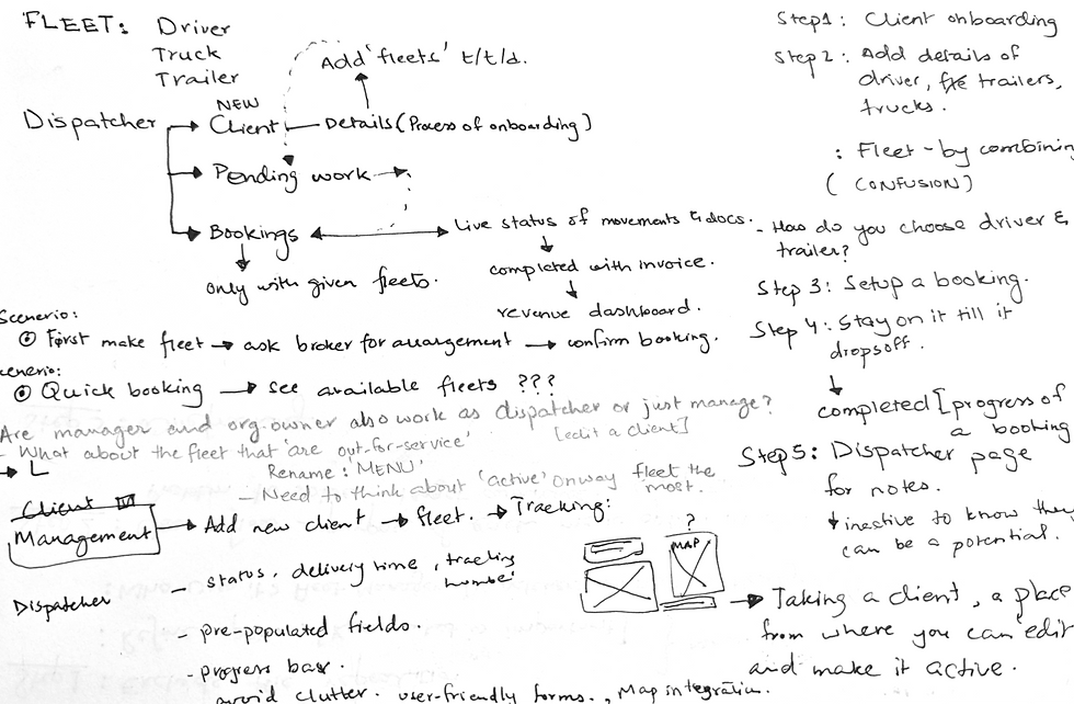
Call me old school but I love doing extensive rough work on paper that helps me refine ideas and streamline the design process. No pretty images here; just a heads-up!
Started off by becoming a user and going through the existing app; that helped me identify the pain points and opportunities for improvement.
Insights (summary)
-
Redundant & repetitive information
-
Cluttered navigation
-
No defined hierarchy
-
Lack of infographic; hence users don't find it helpful after one point
-
Waste of important real-estate
-
No proper space for management and personal workspace

IA helped with laying all the elements in front of the product owner; giving a clear picture of what's happening. Discussed back and forth and came up with a proposed layout removing unnecessary info.

Goals
Simplify the dispatch process for dispatchers and managers.
Centralize fleet management and booking operations.
Improve visibility and insights into fleet activities.
Enhance user engagement and satisfaction.
Solutions
01
Intuitive User Interface
Loads Runner underwent a complete UI overhaul, focusing on simplicity and ease of navigation. The new interface offers intuitive workflows, reducing the learning curve for users.
03
Advanced Analytics
Offering real-time insights into fleet performance, booking trends, and revenue generation. Dispatchers and managers can
make informed decisions based on data-driven analysis.
02
Workspace
A dedicated workspace was introduced, providing dispatchers with a centralized hub to manage fleets, bookings, and to-do lists. This streamlined approach eliminates the need for multiple tools and spreadsheets.
04
Management Tools
Introduced integrated invoicing and team management features, streamlining billing and empowering managers to oversee team progress seamlessly, respectively.

Existing Interface
Lo-fi Wireframe
Hi-fi Prototype
Showing here is the landing page (dashboard) with repetitive info and multiple tabs.
After a few iterations, this wireframe was closest to how we wanted our dashboard to look.
The final design that went up for development.

Grid
System
5 columns
203
24
32
Text Styles


Icons
Color styles
Prototype
After working rigorously; our product is finally about to hit the market. Most thrilling part of this project was that development started soon after I was done with the first screen; one of the reasons why I had been in direct contact with the developers from the start.
If dev felt confused, we used to revisit the design and would iterate it at the spot if needed.
It gives me immense happiness while sharing this prototype as it is a testament to our collaborative effort and innovative approach, setting a new standard for efficiency in trucking dispatch.

Forms UI
Previously, a single slider housed all forms, causing confusion.
Our new design introduces separate, dedicated forms for each feature, making it easier for users to differentiate and navigate.

Alerts and tooltips are essential for a wholesome experience.

Zero-states with actions help in guiding new users.
Impact & Insights
Scalability
The platform is built to scale, accommodating future growth and new features like driver and broker integrations, ensuring long-term relevance and adaptability.
Cost Saving
By minimizing redundant steps and errors, the company has significantly reduced cost in operations and training.
Increased Efficiency
New design reduces the time spent on manual tasks, directly impacting productivity and allowing dispatchers to focus on more strategic activities.
User Adoption
During the beta testing, we gained 4 new clients, further validating the platform's appeal and effectiveness.
Revenue Boost
800% increase in revenue was seen in the internal client's carrier's portfolio in the beta testing phase.
Competitive Advantage
With a better user experience, Loads Runner positions itself ahead of competitors, attracting more clients and establishing a strong market presence.
Reflections
Working on the Loads Runner redesign has been an incredibly rewarding journey. I engaged in every aspect of design, from research and wireframing to creating prototypes and a style guide from scratch, which boosted my confidence in areas like fonts and web colors. Seeing the product owners love the new design was truly gratifying.
Collaborating with stakeholders provided valuable business insights, and I helped them see the link between user satisfaction and product growth. Beyond design, I managed a team of developers and a junior designer, stepping into a tech lead role post-design.
This project allowed me to explore multiple roles, enhancing my leadership and teamwork skills. Problem-solving with the dev team taught me the importance of empathy for both users and colleagues. Overall, this experience reinforced the value of a holistic approach to design and teamwork, which I'll carry into future projects.


