Widget Redesign
Enhancing the support manager's experience within the Salesforce portal. Salesforce is a major client of our company, and this project was pivotal for strengthening our relationships.

My Role
I joined SupportLogic as a UX design apprentice. This was the first major project, I had the privilege of taking the role of primary UX designer, collaborating closely with the team.
Team
Chief Product Officer, Product Manager, UX Designer and Developer
Time Duration
2 weeks - high priority
Process
Understanding the product and issues, finding solutions, multiple iterations, hi-fi design, and handing over
What is SL-Widget?
SupportLogic is a startup that is helping companies to streamline customer support and service operations, by designing products that predict and prevent escalations with the help of generative AI.
This widget is to provide customer managers with an efficient and effective way to access and manage support cases. Allowing users to view important updates without needing to switch to the main SL interface each time.

WHY?
CTO and PMs directly received feedback regarding the issues faced by the support managers. Due to the agile work environment, the company stays connected with clients and asks for suggestions regularly.
As a support manager, I want to see the critical data of my case on the salesforce portal so that I can prioritize the cases and work efficiently. (Problem Statement)
Feedback Summary
-
Data shown on the widget was not helpful enough.
-
Feature was not fulfilling the need/purpose, and wasn't useful.
-
Interface was confusing hence users were getting frustrated.
-
In favor of this feature as it would be beneficial if developed properly.
-
Add 'attention score' of the case on the widget.
Existing Feature
Findings
.jpg)

Misleading tab hierarchy
L-R data hierarchy problem
Wastage of real estate with
vague data
Too much space is used for less
details
Confusing CTA buttons
Optimize the widget by providing managers with specific and targeted data, empowering them to make informed decisions without the need to access the main website. (Goal Statement)
01
ITERATION

-
Left-aligned the header and added CTA for the webpage.
-
Used components for score and sound-bytes from the SL style-guide for consistency.
-
Placed both sections in the same frame without tabs.
-
Need to figure out where the annotations are coming from for better layout.
02
ITERATION

-
Replaced sentiments detected with 'Attention Score'.
-
Carousel numbering shows the total sentiments detected.
-
Only 3 sentiments will be shown; they need to visit the website for more sentiment details.
-
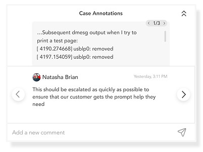
Annotations section is made collapsible due to its' secondary nature.
-
Tooltip for score chart on hover.

-
First window shows the context; a scroll for longer cases.
-
Second, white strip contains the annotations.
-
For quick replies, we gave an option of replying to the annotation directly from the widget.
Proposed SL-Widget


Product Impact
-
Reducing frustration and confusion, leading to increased user retention and satisfaction.
-
Increased engagement translating into higher customer loyalty.
-
Accurate and specific data will give a clear idea of the cases hence making users find more value in the product which may create inclination towards using main portal and features, potentially driving more revenue.
My Experience
-
First project without senior designer's guidance, increased confidence and also learnt managing multiple projects at one time.
-
Project management was the highlight of this project. From the scope to deliverables; everything was done within the time constraints.
-
Learnt how to gather, process and incorporate feedback.
-
Firsthand experience of how my work directly impacts company's business and growth revenue.


